
A Photo field is a type of Media field that allows the user to take photos as a form of data collection.
To enable photo taking functionality, the tag can be added to the appropriate position in the XML file. Example:
|
1 |
<Photo id="Picture" max="2" captureImg="photo.png" optional="true" review="true" /> |
There are many attributes that you can include within the Photo tag, for a full list of these attributes click here.
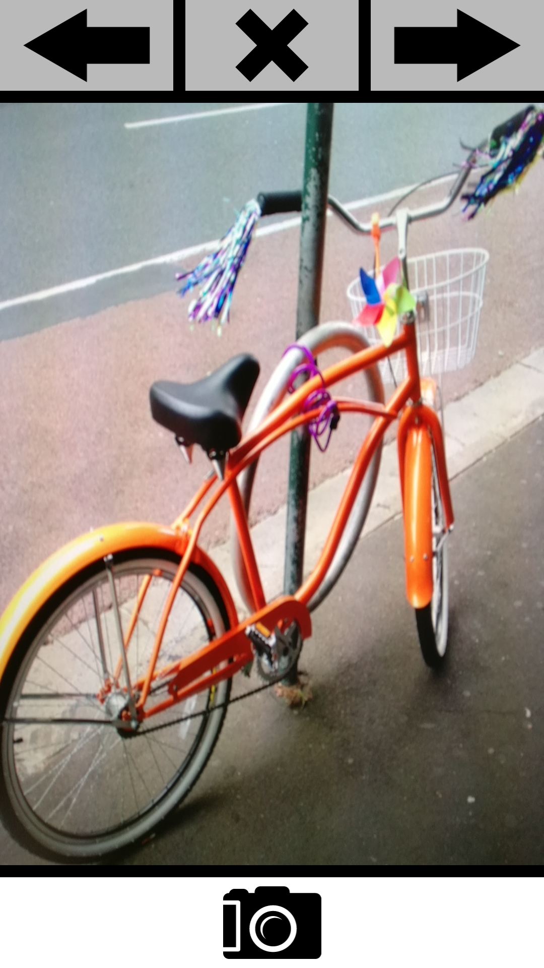
In the above example, the attribute max=”2″ means that the user can take a maximum of two pictures. The attribute captureImg=”photo.png” will display a custom ‘take a photo’ icon at the bottom of the screen (see customised icon section below).
The optional=”true” attribute will provide a skip button, if the user would rather not take a picture for data collection and skip to the next section.
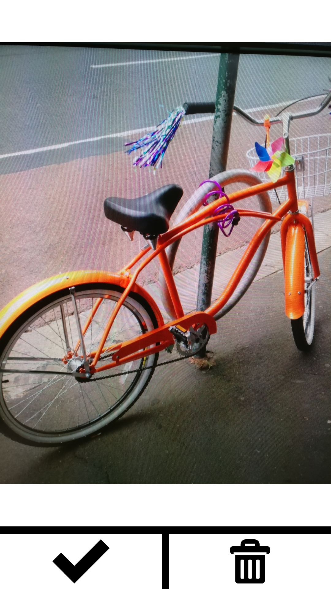
The review=”true” attribute allows the user to review the previously taken photographs. The user can select the photo(s) they wish to save or discard at this stage. A review=”false” would not provide this option and would automatically accept the photograph and take the user to the next section of the project.
Customise icon buttons
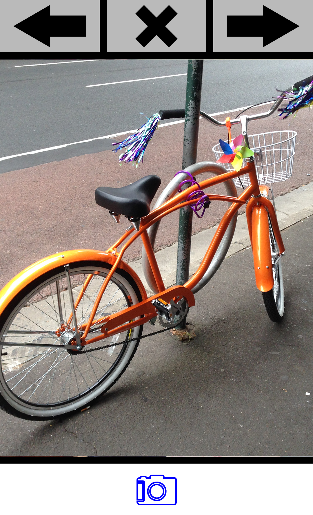
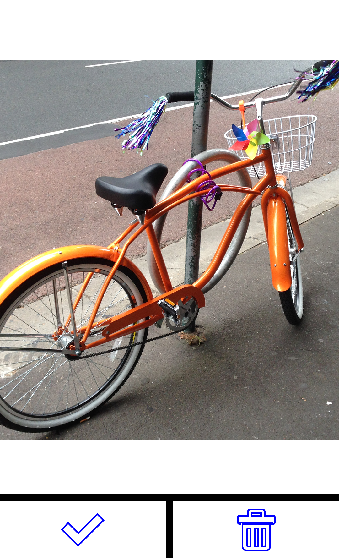
The screens on the left show a customised icon for capturing a photo and a customised icon to discard a photo at the review stage. If you prefer to use your own customised icon buttons, rather than the default icons, you must specify the images you wish to use in the code:
|
1 |
<Photo id="Picture" captureImg="photo_blue.png" discardImg="discard_blue.png" approveImg="accept_blue.png" optional="true"/> |
- captureImg specifies for the icon the user clicks when taking a picture.
- discardImg specifies for the icon the user clicks when deleting a picture they are reviewing.
- approveImg specifies for the icon the user clicks when approving a picture they are reviewing.
Save the images you wish to use as your icons in the ‘img’ folder of your Sapelli project. Make sure they are saved using the same name as that in the code, i.e. “photo.png”.